Dotline Font: A Web Designer’s Layout Test
I was staring at a hero section for a new autumnal lifestyle brand, and something felt off. The layout was clean, the photography was warm and textured, but the typography lacked soul. I needed a typeface that could bridge the gap between high-end editorial design and approachable storytelling. That is when I decided to test Dotline in a live staging environment. As a web designer, I am often skeptical of script fonts because they can easily become illegible on mobile screens or feel too casual for a premium digital product. However, testing this specific font revealed how a sophisticated, rhythmic script can actually enhance user experience when applied with intention.
First Impressions in the Hero Section
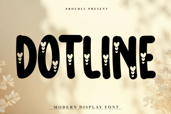
The first place I implemented Dotline was the main headline of the landing page. The brand identity relied heavily on an organic, handcrafted aesthetic, so a standard sans serif font felt too sterile. Dotline immediately provided that unique visual voice we were missing. Its high-contrast strokes created a beautiful rhythm against the negative space of the hero image. Unlike many decorative fonts that sacrifice form for flair, Dotline maintained a professional structure even at large display sizes.
I noticed that the letterforms have a distinct flow that guides the eye horizontally. This is crucial for web design because it encourages scanning behavior rather than stopping the user's momentum. When testing over a darkened background image with white text, the contrast held up beautifully. The thicker downstrokes remained solid without pixelating, while the thinner upstrokes added elegance without disappearing. This balance is rare in handwritten fonts and makes Dotline a viable option for modern web headers where readability is non-negotiable.
Evaluating Readability Across Devices
A font might look stunning on a 27-inch monitor, but web design is ultimately about responsive performance. My next step was checking Dotline on various mobile viewports. Script fonts are notorious for failing on small screens, often requiring excessive zooming or causing line-break issues. I set the hero text to scale fluidly using viewport units and tested it on both iOS and Android devices.
- Mobile Scaling: At smaller sizes, Dotline retained its character without becoming cluttered. The spacing between letters remained consistent, preventing the "tangled" look that plagues lesser script typefaces.
- Touch Targets: While I would never use a decorative font for primary navigation links, I tested it for secondary call-to-action buttons. It worked best for soft CTAs like "View the Collection" or "Read Our Story," adding warmth without compromising the clarity of the interactive element.
- Loading Performance: As a premium font asset, file size matters. Ensuring the webfont files were optimized helped maintain fast load times, which is essential for keeping bounce rates low on image-heavy boutique sites.
The key takeaway from mobile testing was restraint. Dotline shines as a display font for short phrases and titles. Attempting to use it for subheads or body copy resulted in cognitive friction. By restricting its use to high-impact areas, the overall readability of the site actually improved because the visual hierarchy became instantly clear to the user.
Strategic Font Pairing for Digital Brands
No font exists in a vacuum, especially in UI design. To make Dotline work effectively, I needed to pair it with a supporting typeface that grounded the design. Because Dotline has such strong personality and high contrast, pairing it with another serif or ornate script would create visual chaos. Instead, I opted for a clean, geometric sans serif font for all body copy, pricing tables, and footer content.
This combination created a dynamic tension that feels very modern. The sans serif handled the heavy lifting of information delivery, ensuring accessibility and quick comprehension. Meanwhile, Dotline acted as the emotional hook. In the context of an online store, this pairing signaled trust through the functional typography while conveying brand values through the decorative accents. For a coaching website or portfolio, this same strategy works to separate the professional credentials (sans serif) from the personal philosophy (Dotline). It allows the designer to build a comprehensive brand identity system that is both functional and evocative.
Application Beyond the Homepage
Once the hero section was validated, I explored other touchpoints where Dotline could elevate the user journey. Consistency is vital for brand recognition, but repetition of a decorative element can lead to fatigue. I found that Dotline worked exceptionally well in specific micro-interactions and content breaks.
- Section Dividers: Using a single word or short phrase in Dotline between content blocks helped break up long-form sales pages. It acted as a visual breath, resetting the reader's attention before the next value proposition.
- Product Badges: For the e-commerce project, using Dotline for "New Arrival" or "Limited Edition" badges added a tactile, artisanal quality that static labels lacked. It reinforced the boutique nature of the shop directly within the transactional flow.
- Email Headers: Translating the web aesthetic to email marketing required checking rendering across clients. Dotline performed reliably in major email platforms when used as a web-safe fallback or embedded image, maintaining brand continuity from inbox to landing page.
Technical Considerations for Implementation
Before committing Dotline to a production site, there are practical technical checks every digital creator must perform. First, verify the commercial licensing. Using a font for a client website, digital template, or online store requires the appropriate webfont license. Never assume a desktop license covers digital deployment. Second, check for OpenType features. Dotline includes alternates and ligatures that can prevent awkward letter collisions in specific word combinations. Accessing these via CSS font-feature-settings allows for custom refinement that elevates the polish of the final design.
Accessibility should also be a priority. While Dotline is legible for a decorative font, it does not meet WCAG standards for body text. Always ensure that any text rendered in Dotline has sufficient color contrast against its background. If using it for critical information, provide a text alternative or ensure the meaning is conveyed through other accessible means. Treat Dotline as an enhancement to the interface, not the foundation of information architecture.
Refining the Autumnal Visual Voice
Ultimately, choosing Dotline was about aligning the digital interface with the seasonal and emotional tone of the brand. The font embodies an autumnal visual voice—not just through its style, but through its weight and rhythm. It feels grounded yet airy, much like the season itself. In a digital landscape saturated with identical minimalist templates, introducing a typeface with this level of craftsmanship creates a memorable user experience.
For web designers and digital product creators, the lesson is that decorative fonts require more discipline than utility fonts. You cannot simply drop them in and expect magic. They demand thoughtful placement, rigorous testing, and respectful pairing. When treated with that level of professional care, Dotline transforms from a simple asset into a defining element of a polished online brand. It proves that functionality and artistry are not mutually exclusive in modern web design; they are partners in creating digital spaces that people genuinely enjoy inhabiting.